




Your Instagram profile is often the first impression people get of you or your brand. When someone lands on your page, they see your grid before they read your bio or check your follower count. A visually stunning Instagram feed tells visitors in an instant what you’re about, what you value, and whether they want to stick around.
Creating a cohesive, beautiful feed doesn’t require professional photography equipment or design school training. It comes down to making intentional choices about color, composition, editing, and planning. Whether you’re a small business owner, a creative professional, or someone who simply wants a prettier profile, the principles are the same.
This guide walks you through everything you need to know about building a visually stunning Instagram feed. From selecting your color palette to planning your grid layout to maintaining consistency over time, you’ll learn practical techniques that you can start using today.
Why Your Instagram Feed Appearance Matters
Think about the last time you discovered a new Instagram account. Within seconds, you probably made a decision about whether to follow them based on how their feed looked. This split-second judgment happens constantly on social media, and your feed’s appearance plays a major role in whether people choose to engage with your content.
A cohesive visual feed builds trust with visitors. When your images look intentional and well-curated, people assume you put the same care into your products, services, or creative work. Random, disconnected posts can give the impression of disorganization, even if that’s not accurate. Your feed acts as a visual portfolio that represents who you are.
Visual consistency also strengthens brand recognition. When someone scrolls through their home feed and sees one of your posts, a consistent style makes it instantly recognizable as yours before they even read the username. This kind of recognition helps you stand out in a crowded space where people follow hundreds of accounts. Producing high-quality content consistently is what separates memorable accounts from forgettable ones.
For businesses and creators, building a strong Instagram presence starts with your visual foundation. When your feed looks professional and cohesive, you attract followers who appreciate that aesthetic and are more likely to become customers, clients, or fans. A beautiful feed also encourages people to share your content with others, expanding your reach organically.
Beyond attracting new followers, your feed appearance affects how your existing audience perceives your content. Posts that fit within a cohesive feed feel more premium and valuable than identical content that looks randomly placed. The context your feed provides elevates individual posts.
Choosing a Consistent Color Theme
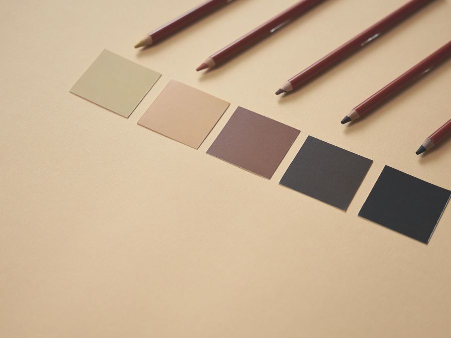
The foundation of any visually stunning Instagram feed is a thoughtful color palette. Color creates the emotional tone of your feed and ties different types of content together into a unified whole. Choosing the right colors and sticking with them transforms a scattered collection of images into something that feels intentional and professional.
Start by identifying three to five main colors that will define your feed. These might come from your brand colors, your personal preferences, or the subject matter you typically photograph. Look at your existing favorite photos and notice which colors appear most often. You might discover that you’re naturally drawn to warm earth tones, cool blues, or bright pastels.
Once you’ve identified your palette, plan your content around it. This doesn’t mean every photo needs to feature your exact colors prominently. Instead, think about how different images will sit next to each other on your grid. A photo with a mostly white background can balance out a more colorful image. Neutral tones give your eyes a place to rest between vibrant shots.
Pay attention to the colors in your backgrounds, not just your main subjects. A beautiful product photo can clash with your feed if it was shot against a background color that doesn’t fit your palette. When possible, plan your photo shoots with your color theme in mind. Consider using custom illustrations to elevate your feed and add visual interest while staying within your color scheme.
Some creators use specific color placement strategies, like ensuring every row contains at least one image with their signature color. Others alternate between light and dark images to create a checkerboard effect. Experiment with different approaches to find what works for your content and aesthetic preferences.
Photo Editing Tools and Techniques

Even the best photographs benefit from editing, and consistent editing is essential for a cohesive feed. Using the same editing approach on all your images creates visual harmony that makes your feed feel polished and intentional. The good news is that powerful editing tools are available right on your phone.
Mobile editing apps have become remarkably sophisticated. Apps like VSCO offer extensive filter libraries and manual adjustment tools that rival desktop software. Lightroom Mobile provides professional-grade controls for exposure, color, and detail. Snapseed, which is free, includes many advanced features like selective adjustments and healing tools.
The key to consistent editing is developing your own preset or editing recipe. Start by adjusting a photo until you love how it looks, then note exactly which settings you changed. Apply those same adjustments to your next several photos and refine the recipe as needed. Many apps let you save custom presets so you can apply your signature look with a single tap.
Consider which aspects of editing matter most for your aesthetic. Some feeds are known for their bright, airy look achieved through lifting shadows and reducing contrast. Others have a moody, desaturated style with deep blacks and muted colors. Some use warm color grading while others lean cool. Pick an approach and stick with it.
Before you edit, make sure your source photos are as good as possible. Exploring creative photoshoot ideas can help you capture more interesting images from the start. When photos have technical problems like blurriness, correcting focus issues before applying your usual edits will give you much better results.
Don’t over-edit. Heavy filters and extreme adjustments can make photos look unnatural and dated quickly. Subtle, consistent editing ages better and looks more professional. Your editing should enhance your photos, not overwhelm them.
Creating and Saving Presets
Most editing apps allow you to save your adjustments as presets for future use. This feature is incredibly valuable for feed consistency. Once you’ve developed an editing style you love, saving it as a preset ensures you can recreate it perfectly on every image.
Build a small library of presets for different situations. You might have one for bright outdoor photos, another for indoor shots, and a third for close-up details. All should share similar characteristics while being optimized for different lighting conditions.
Planning Your Grid Layout
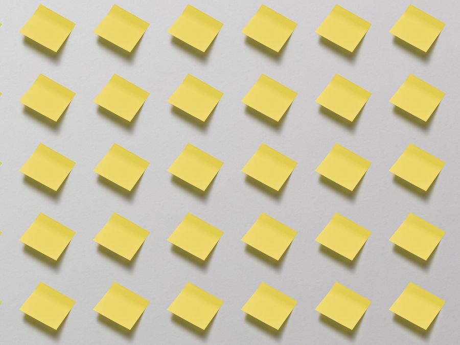
Your Instagram grid is the nine-image preview visitors see when they land on your profile. How these images work together visually is just as important as how each individual photo looks. Planning your grid layout helps ensure every new post enhances your feed rather than disrupting it.
Several popular grid strategies exist. Row themes keep each horizontal row of three images related in some way, perhaps by color, subject, or visual style. Column themes apply the same idea vertically. Checkerboard layouts alternate between two different types of content, like quotes and photos. Puzzle grids spread a single large image or design across multiple posts.
Your Instagram strategy should include grid planning as a core component. Preview apps let you see how upcoming posts will look in your grid before you publish them. These tools display your feed with blank spaces where you can add planned content, rearranging until you find the most visually pleasing arrangement.
Think about rhythm and spacing when planning content. If you post several similar images in a row, your feed can feel monotonous. Alternating between different content types, like wide landscapes and close-up details, creates visual interest. Consider achieving photography success on Instagram by thinking about how individual shots contribute to your overall grid aesthetic.
Balance is another important consideration. If your last three posts were all on the left side of your grid, your feed might feel lopsided. Preview tools help you catch these imbalances before they go live.
Content Variety Within Consistency
While consistency is important, too much sameness becomes boring. Find ways to vary your content while maintaining your overall aesthetic. This might mean including different types of shots, like portraits, landscapes, flat lays, and behind-the-scenes moments, all edited in your signature style.
Think of your feed as a conversation with variety and rhythm. You wouldn’t want someone who only talks about one thing in exactly the same way every time. Similarly, your feed should have movement and interest while still feeling cohesive.
Writing Captions That Complement Your Visuals

A visually stunning Instagram feed extends beyond images alone. Your captions are part of the complete experience, and they should complement your visual style rather than clash with it. The voice and tone of your writing contribute to the overall impression your profile makes.
Develop a consistent caption voice that matches your visual aesthetic. If your feed has a playful, colorful vibe, your captions might be witty and conversational. A more minimal, sophisticated visual style might pair well with shorter, more thoughtful captions. The goal is for your words and images to feel like they come from the same person or brand.
Consider your caption structure as well. Some accounts always use a specific format, like starting with an emoji or ending with a question. Others keep things more varied. Whatever you choose, some level of consistency helps tie your content together.
If you struggle with writing captions, tools like an Instagram caption generator can help you draft ideas that you then personalize with your own voice. The key is making every caption feel authentically yours while serving the purpose of the post.
Caption length is a personal choice that should suit your content and audience. Long-form captions work well for educational content, storytelling, or building deeper connections. Short captions can be effective when the image speaks for itself. Many successful accounts mix both approaches depending on the specific post. With video creation technology making Reels more accessible, remember that caption principles apply to video content too.
Using User-Generated Content in Your Feed
Sharing content from your audience can strengthen your community while providing fresh material for your feed. However, incorporating others’ photos requires care to maintain your visual standards. The challenge is featuring authentic customer or fan content without disrupting your aesthetic.
Understanding what makes user-generated content valuable helps you approach it strategically. When your customers or followers share photos featuring your products or inspired by your content, it builds social proof and authenticity that your own photos can’t replicate. The trick is curating carefully.
Create guidelines for the user-generated content you share. You might only feature photos that match your color palette, meet certain quality standards, or were shot in a particular style. Being selective ensures every post, regardless of who created it, fits seamlessly into your feed.
When you find content to share, learn how to properly regram content on Instagram while giving appropriate credit. Always ask permission before sharing someone else’s content and tag the original creator. This protects you legally and shows respect for your community members.
Consider editing user-generated content with your usual presets before posting to make it match your feed more closely. Some creators ask permission to make minor adjustments, while others only share content that already fits their style. Either approach works as long as you’re transparent with the original creators.
Stories are another great place for user-generated content that might not fit your grid. You can celebrate community members and their content in Stories without affecting your carefully curated main feed.
Curating and Managing Your Feed Over Time
Building a visually stunning Instagram feed is an ongoing process, not a one-time project. Your aesthetic may evolve over time, and older posts might start to feel out of place. Learning how to manage your existing content keeps your feed looking fresh.
Instagram’s archive feature lets you remove posts from your grid without deleting them permanently. This is useful when older content no longer fits your aesthetic but you don’t want to lose the memories, comments, or engagement data. Archived posts are hidden from your profile but remain accessible to you.
Periodically review your entire feed with fresh eyes. Scroll through your grid and notice which posts stand out as inconsistent. Maybe an image from years ago was edited differently, or you shared something that doesn’t quite fit your current direction. Consider archiving these posts to strengthen your overall aesthetic.
If you change your mind about archived content, you can easily restore archived Instagram posts at any time. This makes archiving low-risk. You can experiment with removing posts and bringing them back if your feed feels incomplete without them.
Deleting posts is also an option, though it’s more permanent. Some creators delete underperforming content or posts that received negative engagement. Others prefer to keep everything and use archiving instead. There’s no right answer, just choose the approach that works for your situation.
As you grow and evolve, don’t be afraid to let your feed evolve too. Many successful accounts have shifted their aesthetic over time. The key is making changes gradually and intentionally rather than abruptly jumping from one style to another.
Extending Your Visual Brand Beyond Instagram
Your Instagram aesthetic shouldn’t exist in isolation. The visual identity you’ve built can and should extend to your other platforms and properties. Consistency across channels reinforces your brand and creates a more memorable overall presence.
When you integrate Instagram with your website, maintain visual cohesion between the two. Your website colors, fonts, and imagery should complement your Instagram feed. If your feed has warm, earthy tones, a website with bright neon colors would feel disconnected. Visitors should recognize your style whether they find you on Instagram, your website, or anywhere else.
Apply your editing presets and color palette to content on other social platforms as well. Your Pinterest pins, Twitter graphics, and LinkedIn posts can all share visual DNA with your Instagram feed. This doesn’t mean everything looks identical, but common threads should connect your various presences.
Think about your visual brand holistically. Your Instagram feed is one expression of your aesthetic, not the whole thing. Develop brand guidelines for yourself that cover colors, fonts, photography styles, and editing approaches. These guidelines help you stay consistent as you create content for different purposes and platforms.
Even your email newsletters, presentation slides, and printed materials can reflect your Instagram aesthetic. The more consistently you present yourself visually, the more memorable and professional you appear. Your visually stunning Instagram feed becomes the foundation of a broader visual identity.
Building a visually stunning Instagram feed takes time and intention, but the results are worth the effort. Start with a clear color palette, develop consistent editing habits, plan your grid thoughtfully, and curate your content over time. The techniques you’ve learned here will help you create an Instagram presence that attracts followers, builds trust, and authentically represents who you are.