


Social media is evolving so quickly that strategies which worked a year ago feel outdated today. Creators and brands are constantly searching for the next growth edge, but one of the most powerful tools is hiding in plain sight: typography. Creative typography has quietly become one of the simplest ways to elevate content, improve retention, and strengthen brand identity across every platform.
This shift didn’t happen randomly. As social feeds became overcrowded, audiences began gravitating toward visual experiences that felt more intentional and expressive. Typography emerged as a way to communicate emotion instantly, even before the viewer reads a single word.
Today, typography is no longer just a design choice. It has become a key storytelling tool and a growth mechanism that affects how deeply people connect with your content. If you’re not using typography strategically on social media, you’re missing one of the easiest pathways to stronger engagement.
1. Why Typography Matters More Than Ever on Social Media
Typography has become essential because it shapes how users interpret content in the first few milliseconds. People scroll fast, and their brains make snap judgments based on shape, color, and style before processing text. This means typography often determines whether someone keeps scrolling or stops to read your message.
Unlike long-form media, social platforms bombard users with competing visuals. Typography gives you a way to stand out by adding personality and emotional cues that images alone can’t express. It gives your content structure and identity in a chaotic, fast-moving environment.
More importantly, typography creates mood instantly. A clean, modern type creates a sense of professionalism, while a playful, rounded font adds charm and friendliness. These emotional signals influence how people feel as they interact with your content.
2. The Psychology Behind Typography in the Scroll Era
Typography influences behavior because humans respond emotionally to visual cues. Different type styles trigger different subconscious reactions, which impact how long we pay attention. This makes typography a psychological shortcut for capturing and holding interest.
Bold, condensed fonts convey urgency and confidence. They make the viewer feel like the message is important and must be read quickly. This is why these fonts thrive in fast-paced tip posts, motivational statements, and high-impact hooks.
Rounded, soft fonts signal warmth, kindness, and approachability. These styles make the viewer feel more comfortable and safe, which works beautifully for self-care content, storytelling, and lifestyle posts. The emotional softness invites deeper reading even if the content is long.
Serif fonts, especially modern or editorial ones, create a sense of intelligence and sophistication. They evoke magazine-style credibility that instantly elevates even simple messages. That’s why they dominate quote graphics, carousel headlines, and long-form informational content.
When typography aligns with the emotional goal of your message, your post becomes more persuasive and memorable. This alignment is what turns simple text into content that feels designed instead of improvised. That feeling of intention is what helps posts spread and gain traction.
3. How Typography Has Shaped Modern Social Media Content Formats
Typography is not just changing how social media looks; it is changing the content itself. Today, many successful posts depend almost completely on type design. This change shows how text and images have come together to form a single narrative.
Carousel Posts on Instagram and LinkedIn
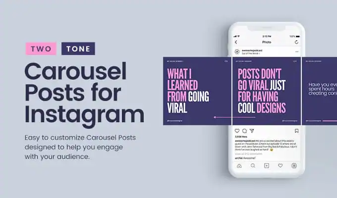
Carousel posts on platforms like Instagram and LinkedIn keep people watching by presenting info in a visually interesting way. Typography helps each slide feel like part of a story, guiding the viewer’s eye and building expectation. If the type layout is well done, people are more likely to swipe through all the slides, which increases how long they pay attention and how likely they are to save the post.
Short-Form Videos with Text Overlays
Millions of TikToks and Reels rely solely on typography to deliver the message. Viewers often watch silently, so the text must do the talking. Good typography creates rhythm, timing, and clarity within the video, keeping viewers from swiping away too early.
Quote Graphics and Memes
Typography determines whether a quote feels profound, funny, or forgettable. A beautiful font turns even a simple idea into something save-worthy. A poorly designed type choice, however, can make a quote feel unprofessional or boring.
Typography-driven formats succeed because they simplify content while enhancing emotional impact. They make information feel structured, polished, and easy to process. And in a world where attention spans shrink every year, clarity is currency.
4. Typography as a Branding Superpower on Social Media
Typography is becoming the visual fingerprint of modern brands. While logos and colors once dominated brand identity, social media requires more dynamic assets. Typography fills that gap by offering a recognizable style that can be used daily across diverse content formats.
When your audience sees consistent typography across posts, they instinctively associate it with your brand. This consistency builds trust and makes your content instantly identifiable, even without your logo. It’s the same reason why certain creators’ posts are recognizable before you even look at their usernames.
Typography also communicates your brand personality. A sharp, futuristic font conveys innovation. A soft script communicates comfort and human warmth.
These choices make your brand feel intentional and polished. Audiences subconsciously trust brands that look cohesive, because cohesion signals care. Care signals professionalism—and professionalism leads to faster growth.
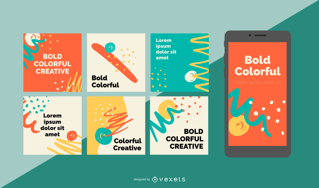
5. The Rise of Playful, Expressive Typography on Social Media
Beyond clean and professional styles, playful typography is having a huge moment online. Creators are using quirky, nostalgic, and expressive fonts to inject humor and character into their posts. This trend is driven by audiences who are tired of overly corporate content.
Fun type styles help creators embrace personality. They make content feel more alive and conversational. This energy increases shareability, especially among younger audiences.
Many creators now turn to playful tools to generate unique type effects. One popular example is the spongebob font generator, which adds a cartoonish, exaggerated look that instantly gives posts a humorous twist. This kind of typography helps creators express tone without needing extra visuals.
Playful fonts thrive because they give the viewer a small emotional reward—delight. Delight is one of the strongest motivations for shares and comments. If your content makes someone smile, they’ll pass it along effortlessly.
6. Why Typography Is the Easiest Growth Hack Most Creators Ignore
Creators often spend lots of time thinking about content but little time on fonts. This is a mistake, since good typography can quickly change how people see your content. A well-designed post seems better, even if the actual words are the same.
Typography gives structure to your content, which makes it easier to understand. Clear content helps keep viewers interested, and this increases how viewers engage with your posts. This has an influence on how algorithms handle your content.
It also makes you look like an expert. If your posts look good, people will think you are knowledgeable. This feeling encourages them to save, share, and visit your profile more often.
The good news is that typography does not need a lot of design skill. With simple tools, you can create content that looks consistent and expresses emotion. It’s easy to do compared to the big improvements it brings in how easily people can find you and how long they remember you.
When creators begin to use typography on purpose, their whole feed gets better. The content seems more organized, branded, and professional. This kind of change can create long-term growth, not just a single viral event.
7. How to Use Typography Strategically for Better Social Media Performance
Typography can really improve things if you use it on purpose, not just randomly. If you plan it out, your content will look consistent and connect with people emotionally. Here are some easy tips to make any online feed better, no matter what it’s about:
1. Use Typographic Hierarchy
Hierarchy guides the viewer through your message step by step. The main idea should always be the boldest and largest element. Supporting text should be softer, helping your audience focus without confusion.
2. Stick to Two or Three Fonts
Using too many fonts looks messy and confuses your brand. Two main fonts, one for headings and one for the text, are often enough. You can add a third to show some style, but don’t overdo it.
3. Match Font Style to Message Tone
Generous use of negative space prevents text from appearing crowded and overwhelming. Open spacing between letters, lines, and paragraphs enhances visual clarity. Clean spacing improves the perceived quality and ease of engagement.
4. Use Negative Space Generously
Maintaining a consistent typographic identity across posts builds brand recognition. Viewers start associating a specific style with your brand. This familiarity can build trust, encouraging viewers to return.
5. Create a Consistent Typographic Identity
Maintaining a consistent typographic identity across posts builds brand recognition. Viewers start associating a specific style with your brand. This familiarity can build trust, encouraging viewers to return.
These methods make content look more deliberate, appealing, and memorable. They also ease the reading experience, which can improve engagement, so readers are more likely to finish the content.
8. Why Creative Typography Will Continue to Dominate Social Media
Typography solves a core problem on social media: information overload. It helps simplify complex ideas and guide the viewer’s eye in a chaotic environment. This usefulness ensures typography will remain central to social media design trends.
AI tools and design apps are making typography more accessible than ever. Creators can now build professional-level type systems without hiring designers. This accessibility fuels creative experimentation, which further drives the trend.
Platforms themselves are encouraging typography use. Instagram templates, TikTok texts, YouTube thumbnails—all rely on type as a core visual tool. The more these platforms highlight typography, the more creators follow suit.
As audiences become more visual, typography will keep shaping how content is understood. It will remain a foundational part of digital storytelling. And brands that embrace it early will continue to stand out in increasingly competitive feeds.
Final Thoughts
Typography is a key part of any modern social media plan. It makes content easier to understand, looks better, and shares feelings quicker than just words. If you’re trying to get people involved, make your brand stronger, or tell better stories, good typography can really help.
You don’t have to be a designer to do it right. Choosing a couple of fonts, thinking things through, and adding your own style can change how your social media looks. Getting people to notice you is tough, and typography can help you stand out.