




When you scroll through YouTube, what makes you stop and click on a video? Often, it’s the colors that catch your eye first. Before you read a single word or recognize a face, your brain processes the colors in a thumbnail and makes a split-second judgment about whether that video is worth your time.
This is where color psychology YouTube branding becomes a powerful tool for creators. The colors you choose for your channel aren’t just decorative choices—they send signals to potential viewers about what kind of content you create and how it will make them feel. A finance channel using calm blues sends a very different message than a gaming channel bursting with neon greens and purples.
Understanding how colors work on a psychological level can help you make smarter branding decisions. When you pick colors that align with your content and audience, you create a visual identity that people remember. Over time, viewers start recognizing your thumbnails before they even read the title. That kind of instant recognition is what separates casual viewers from loyal subscribers.
In this guide, you’ll learn how different colors affect emotions, how to build a color palette that fits your channel, and how to apply your colors consistently across every part of your YouTube presence. Whether you’re starting a new channel or refreshing an existing one, these principles will help you build a stronger, more memorable brand.
Why Color Psychology Matters for YouTube Branding
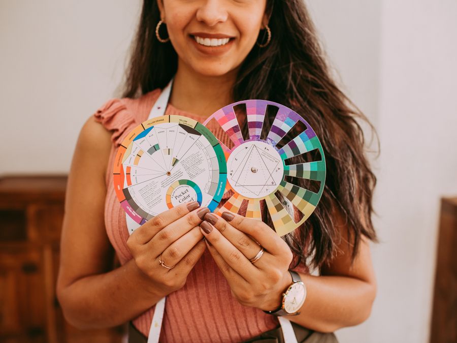
Color psychology is the study of how colors influence human behavior and emotions. This field has been used in marketing and advertising for decades, and it applies directly to YouTube creators who want to stand out in a crowded space.
When someone sees your thumbnail, their brain processes the colors before anything else. This happens in milliseconds, much faster than reading text or recognizing faces. Those initial color impressions create an emotional response that can determine whether someone clicks on your video or keeps scrolling.
Think about how you feel when you see a bright red notification badge versus a soft blue icon. Red creates urgency and grabs attention immediately. Blue feels calmer and more trustworthy. These reactions aren’t random—they’re deeply connected to how our brains have evolved to respond to different colors in our environment.
For YouTube creators, understanding these responses means you can design thumbnails and channel art that trigger the right emotions in your target audience. A cooking channel might use warm oranges and yellows to evoke feelings of comfort and appetite. A tech review channel might lean into cool blues and silvers to suggest professionalism and innovation.
Consistent color choices also help with building audience loyalty over time. When you use the same color palette across all your content, viewers start to associate those colors with your brand. They can spot your videos in their feed without reading the title, which makes them more likely to click because they already know and trust your content.
Color psychology YouTube branding isn’t about manipulating viewers—it’s about communicating clearly. Your colors should honestly represent what kind of experience people can expect from your channel. When your visual branding matches your content, viewers feel satisfied because they got what they expected. That satisfaction builds trust, and trust builds a loyal audience.
How Different Colors Affect Viewer Emotions

Each color carries its own set of emotional associations. Understanding these associations helps you choose colors that align with your channel’s personality and the feelings you want to create in your audience.
Red is one of the most powerful colors for grabbing attention. It creates feelings of excitement, energy, and urgency. Many gaming channels and entertainment creators use red because it suggests action and intensity. However, too much red can feel aggressive, so it works best as an accent color or in combination with more neutral tones.
Blue is associated with trust, stability, and professionalism. Educational channels, tech reviewers, and business content creators often use blue because it makes viewers feel they’re getting reliable information. Lighter blues feel friendly and approachable, while darker blues convey authority and expertise.
Yellow communicates happiness, optimism, and creativity. It’s an attention-grabbing color that works well for lifestyle content, comedy, and channels aimed at younger audiences. Yellow can be overwhelming in large amounts, so it’s often paired with darker colors for balance.
Green suggests growth, health, and nature. It’s a natural choice for fitness channels, outdoor content, and sustainability-focused creators. Green also has calming properties, making it useful for wellness and meditation content.
Orange combines the energy of red with the friendliness of yellow. It feels enthusiastic and approachable, which makes it popular for DIY channels, cooking content, and creators who want to seem accessible and fun.
Purple has associations with creativity, luxury, and imagination. It’s often used by beauty channels, artistic creators, and content that positions itself as unique or premium.
Black and white create contrast and sophistication. They work well for minimalist brands, fashion content, and channels that want a clean, professional look.
These emotional associations can boost engagement and help with engaging your audience on social media beyond YouTube. When your colors evoke the right emotions, viewers are more likely to watch longer, comment, and share your content.
Attention-grabbing colors also play a role in creating viral video content. Thumbnails that stand out visually are more likely to get clicked, and that initial click is the first step toward a video taking off. Choose colors that fit your content but also create enough contrast to pop against YouTube’s white and gray interface.
Choosing the Right Color Palette for Your Channel
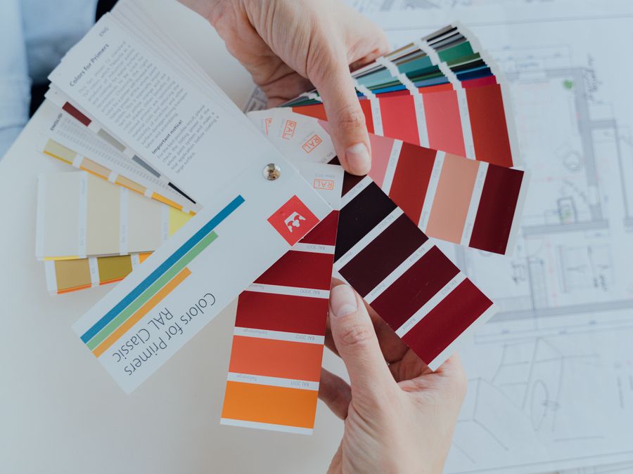
Now that you understand what different colors communicate, it’s time to build a color palette that fits your channel. A good palette typically includes three to five colors that work together harmoniously.
Start by choosing your primary color. This is the main color that represents your brand—the one viewers will most strongly associate with your channel. Consider your content niche and the emotions you want to evoke. If you run a fitness channel, green or orange might be your primary color. If you create calming ASMR content, soft blues or purples could work well.
Next, select one or two secondary colors that complement your primary choice. These colors will appear in supporting elements like backgrounds, text boxes, and lower thirds. They should contrast enough with your primary color to be visually interesting but not clash in an unpleasant way.
Finally, pick an accent color for elements that need to stand out, like call-to-action buttons, subscribe reminders, or important text. Accent colors are often brighter or bolder than your other colors because they need to grab attention.
Tools like Adobe Color make it easy to experiment with different combinations. You can start with one color and see complementary, analogous, or triadic color schemes that work well together. This takes the guesswork out of finding colors that harmonize.
For quick inspiration, Coolors generates complete palettes with a single click. You can lock colors you like and regenerate the rest until you find a combination that feels right for your channel.
Remember that your color palette is part of a complete branding strategy. Just as you might use brand name selection tools to find the right channel name, your colors should work alongside your name, logo, and content style to create a cohesive identity.
Before finalizing your palette, test how your colors look on different devices. A color that looks vibrant on your computer monitor might appear washed out on a smartphone screen. Since most YouTube viewing happens on mobile devices, make sure your colors pop on smaller screens.
Applying Your Colors to Thumbnails and Channel Art
Once you’ve chosen your palette, it’s time to put those colors to work across every visual element of your channel. Consistent application is what transforms a collection of colors into a recognizable brand.
Thumbnails are where your colors matter most. Every video is an opportunity to reinforce your visual brand. Use your primary color prominently in most thumbnails, whether that’s in the background, text, or border elements. This consistency helps viewers recognize your content instantly when scrolling through their feed.
When designing thumbnails, think about contrast. Your text needs to be readable against your background colors. If your primary color is dark, use light-colored text. If it’s light, go with dark text. The goal is instant readability—viewers shouldn’t have to squint to understand what your video is about.
Your channel banner is prime real estate for your brand colors. This large image at the top of your channel page sets the tone for new visitors. Use your full color palette here to show what visual experience viewers can expect from your content.
Your profile picture should incorporate your colors too. Since this image appears small next to your comments and in subscriber feeds, bold colors help it stand out. Many creators use their primary brand color as a background or border for their profile image.
Video overlays and lower thirds offer another branding opportunity. These elements appear during your videos and should match your thumbnail style. When your overlays use the same colors as your thumbnails, it creates a seamless viewing experience.
A beginner-friendly design tool like Canva makes creating branded thumbnails and channel art accessible to everyone. You can save your color codes as a brand kit and apply them consistently across all your designs without being a professional graphic designer.
Don’t forget about Shorts. Your YouTube Shorts growth strategy should include consistent branding too. Even though Shorts thumbnails are smaller, using your brand colors in the video content itself helps viewers recognize your style when scrolling through the Shorts feed.
End screens and cards are often overlooked branding opportunities. These elements that appear at the end of your videos or pop up during playback should also use your brand colors. Every visual touchpoint is a chance to reinforce your identity.
Keeping Colors Consistent Across Your Brand
Creating a beautiful color palette is only half the work. The real power of color psychology YouTube branding comes from consistent application across every platform and piece of content you create.
Start by documenting your exact color codes. Write down the hex codes, RGB values, and CMYK values for each color in your palette. This ensures you use the exact same colors every time, not just colors that look similar. Even small variations can weaken your brand recognition over time.
Consider how your colors appear in your actual video content, not just your thumbnails. If you have a studio setup, think about incorporating your brand colors into your background, lighting, or props. Some creators use colored lighting or branded backdrops to make their video content feel connected to their channel art.
When learning video editing basics, pay attention to color grading. The way you color grade your footage affects how your brand colors appear on screen. Consistent color grading across all your videos creates a cohesive visual style that viewers subconsciously recognize.
Your brand colors should extend beyond YouTube. If you have a presence on Instagram, Twitter, TikTok, or any other platform, use the same color palette. When someone follows you from YouTube to Instagram, they should immediately recognize your brand from the colors.
Building a strong cross-platform streaming presence requires this kind of visual consistency. Whether someone discovers you on Twitch, YouTube, or social media, your colors should tell them they’ve found the right creator.
Create templates for recurring content. If you make weekly series, design thumbnail templates that use your colors consistently while allowing for variation in the specific content. This saves time and ensures brand consistency even when you’re creating content quickly.
Keep a style guide for yourself or your team. Document not just your colors but how to use them—which color is for backgrounds, which is for text, which is for accents. This prevents inconsistencies, especially if you ever hire help with graphics or video editing.
Review your older content periodically. As your brand evolves, you might find older thumbnails that don’t match your current color palette. Updating these thumbnails can improve your channel’s overall visual consistency and potentially boost clicks on older videos.
Testing and Improving Your Color Choices
Your initial color choices are a starting point, not a final decision. The best YouTube creators continuously test and refine their visual branding based on how their audience responds.
YouTube Analytics provides valuable data about thumbnail performance. Pay attention to your click-through rate, which tells you what percentage of people who see your thumbnail actually click on your video. If certain videos have higher click-through rates, examine what colors you used in those thumbnails.
A/B testing gives you concrete answers about what works. Tools like TubeBuddy allow you to test different thumbnail designs against each other. You can create two versions of a thumbnail with different color treatments and see which one gets more clicks over time.
When testing colors, change one element at a time. If you change everything about a thumbnail, you won’t know which change affected performance. Try testing different background colors while keeping text and images the same, then test different text colors, and so on.
Look at your impressions click-through rate for patterns. Do thumbnails with your accent color in the title text perform better than those using your primary color? Do darker backgrounds get more clicks than lighter ones? This data helps you make informed decisions rather than guessing.
The YouTube Creator Academy offers free resources for learning more about optimizing your channel visuals. Their courses cover thumbnail best practices and can help you understand how to use data to improve your branding.
Combining visual testing with AI-powered content optimization can accelerate your improvement. Data-driven approaches help you identify patterns you might miss on your own and make smarter decisions about your visual branding.
Don’t be afraid to evolve your colors over time. Many successful creators have refreshed their brand colors as their channels grew. The key is making changes deliberately based on data and audience feedback rather than changing randomly.
Ask your audience directly. Community posts, polls, and comments can give you qualitative feedback about how viewers perceive your colors. Sometimes viewers notice things that analytics can’t capture, like whether your colors feel right for your content type.
Remember that testing is an ongoing process. What works today might not work as well in a year as trends change and your audience grows. Regular evaluation ensures your color psychology YouTube branding continues to serve your channel effectively.
Building a strong visual brand takes time and effort, but the results are worth it. When viewers can recognize your content instantly, you’ve created something powerful—a brand that stands out in their minds and keeps them coming back for more. Start with thoughtful color choices, apply them consistently, and keep refining based on what your audience responds to. Your colors are one of the most powerful tools you have for building a memorable YouTube presence.