


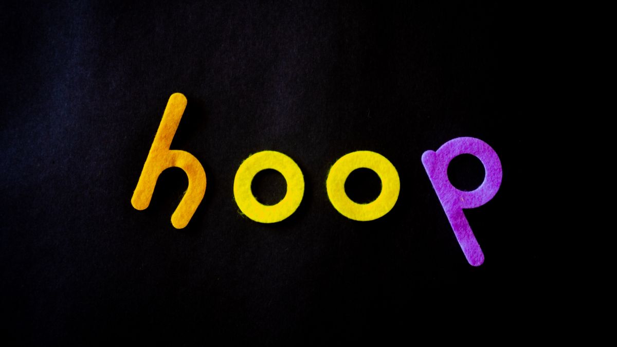

When you scroll through your social media feed, what makes you stop? Maybe it’s a striking photo, a bold statement, or an unexpected visual element that grabs your attention. More often than you might realize, the fonts and text styling in a post play a huge role in whether you pause or keep scrolling.
Creative typography social media strategies are quickly becoming one of the most underrated ways to grow your online presence. While most people focus on hashtags, posting times, and content calendars, they overlook the power of thoughtful font choices and text design. The way your words look matters just as much as what those words say.
Typography isn’t just for graphic designers or big brands with fancy creative teams. Anyone can learn to use fonts and text styling in ways that make their posts more eye-catching and memorable. Whether you’re building a personal brand, running a small business, or just trying to get more eyes on your content, understanding typography can give you an edge that most people don’t think about.
This article will walk you through everything you need to know about using creative typography on social media. You’ll learn what typography actually means, discover free tools to help you find great fonts, get platform-specific tips, and understand how to avoid common mistakes. By the end, you’ll have practical knowledge you can start applying to your very next post.
What Is Creative Typography and Why Does It Matter on Social Media

Typography is simply the art of arranging text in a way that makes it visually appealing and easy to read. This includes choosing fonts, adjusting spacing between letters, deciding on text size, and picking colors. Creative typography takes this a step further by using these elements in unexpected or artistic ways to create a specific mood or grab attention.
On social media, typography matters because everything moves fast. People scroll through hundreds of posts every day, and most content blends together into a blur of similar-looking updates. When you use distinctive typography, you create a visual pause. Your post becomes a tiny billboard in an endless highway of content, asking viewers to slow down and pay attention.
Think about how social media’s influence on modern audiences has changed the way we consume information. People have shorter attention spans and higher expectations for visual quality. Text that looks boring or generic gets ignored, even if the message behind it is valuable. Creative typography helps bridge that gap by making your words feel more intentional and worth reading.
Typography also communicates personality before anyone reads a single word. A handwritten-style font feels warm and personal. A bold sans-serif font feels modern and confident. A vintage typeface suggests nostalgia or craftsmanship. These subtle cues help establish your brand identity and connect with the right audience instantly.
The best part is that you don’t need design experience to start using typography more thoughtfully. Simple choices like switching from a basic font to something more distinctive can make a noticeable difference in how people respond to your content. It’s one of those small changes that can lead to big results over time.
How Typography Helps Your Content Stand Out in Crowded Feeds
Social media feeds are crowded places. Every platform is filled with posts competing for attention, and users have learned to scroll past anything that doesn’t immediately interest them. Typography gives you a tool to break through that noise without relying solely on flashy images or controversial statements.
When someone scrolls through a feed, their eyes naturally catch on visual differences. A post with standard system fonts looks like everything else. But a post with a well-chosen display font, thoughtful text hierarchy, or creative text treatment stands out immediately. This visual contrast is what stops the scroll and earns you those precious seconds of attention.
Typography also helps organize information in ways that are easy to digest. Using different font sizes and weights can guide the viewer’s eye to the most important parts of your message first. A bold headline draws attention, supporting text provides context, and call-to-action phrases stand out clearly. This hierarchy makes your content more accessible and engaging.
If you’re working on visual content strategies for Instagram or other image-focused platforms, typography becomes even more important. Text overlays on photos, quote graphics, and carousel posts all rely on good typography to communicate effectively. The font choices you make become part of the visual composition, working alongside your images rather than competing with them.
Consider that creating compelling social media content involves multiple elements working together. Typography is one of those elements that many people forget about. When you pay attention to how your text looks, you’re adding another layer of polish that sets your content apart from creators who only focus on what they’re saying, not how it appears.
Another benefit is memorability. Distinctive typography helps people recognize your content even before they see your name or profile picture. If you consistently use the same font combinations and text styles, your audience starts to associate those visual elements with you. This kind of visual recognition builds brand awareness over time and makes your content feel more professional and intentional.
Creative Font Tools You Can Start Using Today

Finding the right fonts doesn’t have to be difficult or expensive. There are plenty of tools available that make it easy to discover, preview, and use creative typography in your social media posts. Here are some of the best options to explore.
For a huge selection of free, high-quality fonts, Google Fonts is an excellent starting point. This library offers hundreds of font families that you can use for free on any project. The interface makes it easy to browse by style, weight, and language support. You can also preview how different fonts look with your own sample text before downloading them.
If you have an Adobe Creative Cloud subscription, Adobe Fonts gives you access to an extensive professional font library. These fonts are designed by top foundries and work seamlessly with Adobe applications like Photoshop and Illustrator. The quality is excellent, and you’ll find options ranging from classic designs to cutting-edge display fonts.
One challenge many people face is figuring out which fonts work well together. That’s where Fontjoy comes in handy. This tool uses machine learning to generate font pairings that complement each other. You can lock in fonts you like and generate new suggestions for the remaining slots. It takes the guesswork out of font pairing and helps you discover combinations you might never have tried on your own.
Sometimes you want something more playful and fun for casual content. Novelty font generators can add unexpected personality to your posts. For example, a spongebob font generator lets you create text with that familiar alternating case style. These kinds of tools are perfect for meme-style content or posts where you want to convey humor and relatability.
Many modern AI tools for content creators also include typography features. These platforms can suggest fonts based on your content type, automatically generate text layouts, or even create custom lettering. As AI technology continues to develop, expect even more options for creators who want unique typography without extensive design training.
Beyond these specific tools, most design platforms include built-in font libraries that are quite capable. The key is to spend time exploring your options rather than defaulting to the first font you see. Try different combinations, preview them at the sizes you’ll actually use, and don’t be afraid to experiment with options outside your comfort zone.
Remember that the best font for your project depends on your message, your audience, and where the content will appear. A font that looks great in a desktop preview might be hard to read on a small phone screen. Always test your typography choices in the actual context where your audience will see them.
Designing with Typography in Visual Tools
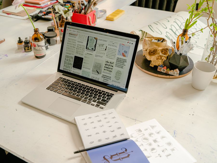
Having great fonts is only part of the equation. You also need tools that make it easy to apply typography to your social media graphics. Fortunately, there are user-friendly design platforms that put professional-looking results within reach of anyone.
Canva is one of the most popular options for social media creators. Its drag-and-drop interface makes it simple to add text to images, create quote graphics, and design carousel posts. The platform includes a large font library and offers templates that show you how professional designers use typography effectively.
When working with typography in any design tool, pay attention to how text interacts with the other elements in your composition. White space around your text helps it breathe and improves readability. Text placed over busy image areas needs higher contrast or a background shape to remain legible. These small details make a big difference in the final result.
Motion adds another dimension to typography. Research shows that animation and motion design boost engagement on social media. Animated text that fades in, slides across the screen, or morphs between styles catches the eye more effectively than static text. Many design tools now include simple animation features that let you add movement to your typography without video editing skills.
Kinetic typography, where words move and change in sync with audio, has become especially popular on short-form video platforms. Even basic text animations like having words appear one at a time can make your content more dynamic and engaging. Consider incorporating motion into your typography strategy if you create video content.
When designing, always preview your work at actual size on a mobile device. What looks great on a large computer screen might be completely unreadable on a phone. Since most social media consumption happens on mobile, this step is essential for ensuring your typography actually works for your audience.
Typography Tips for Different Social Platforms

Each social media platform has its own culture, technical specifications, and user expectations. What works perfectly on one platform might fall flat on another. Here’s how to adapt your typography approach for different networks.
Instagram is highly visual, and typography often appears as overlays on photos or as the main element in quote graphics. Bold, clean fonts tend to perform well because they need to be readable in thumbnail previews. Since Instagram limits bio fonts and caption styling, using typography in your actual images and Stories becomes the main way to differentiate your visual style.
For Facebook, you have more flexibility because posts can appear larger in the feed. However, the platform’s audience skews slightly older, so readability should be a top priority. Avoid overly trendy fonts that might feel confusing to users who aren’t familiar with current design trends. Classic, well-proportioned fonts often work better here.
Twitter (now X) is primarily text-based, but typography still matters in shared images and link previews. Since tweets often compete in fast-moving conversations, any typography in images needs to be instantly readable. Keep text short and fonts simple. High contrast between text and background is especially important.
When considering social media in digital marketing, TikTok and YouTube Shorts represent an interesting typography challenge. These platforms favor bold, often playful fonts that match the energetic, casual tone of short-form video. Captions and text overlays should be large enough to read on small screens and positioned where they won’t be covered by the interface elements.
LinkedIn calls for more professional typography choices. Playful or trendy fonts might undermine your credibility in this business-focused environment. Stick with clean, modern fonts that project competence and trustworthiness. Your typography should feel polished without being overly corporate or boring.
Pinterest users are often searching for inspiration and ideas, so your typography should catch attention in search results and feeds. Vertical pins with clear, legible text overlays perform well. Consider how your typography looks as a small thumbnail, since that’s often the first impression users get.
Across all platforms, the fundamental principle remains the same: typography should serve your message and connect with your specific audience. Pay attention to what successful creators in your niche are doing with their text styling, then put your own spin on those approaches.
Building a Consistent Typography Style for Your Brand
Using creative typography sporadically is helpful, but the real power comes from developing a consistent style that becomes recognizable across all your content. This typography identity becomes part of your overall brand, helping people identify your posts even before they see your name.
Start by selecting a small set of fonts that you’ll use consistently. Most brands work with two to four fonts: a primary font for headlines, a secondary font for body text, and perhaps an accent font for special emphasis. Using the same combinations repeatedly builds visual recognition and makes your content creation process more efficient.
Define rules for how you’ll use each font. Maybe your headline font is always in a specific size and color. Perhaps your accent font only appears for quotes or key phrases. These self-imposed guidelines create coherence across all your posts and prevent your content from feeling random or disconnected.
Consistency extends beyond font choices to include text styling decisions. Will you use all caps for headlines? How much letter spacing will you add? What text colors complement your brand palette? Document these choices so you can apply them consistently, even when creating content quickly.
Consider how typography fits into your broader SEO strategies for social media growth. A recognizable visual identity helps with brand searches and makes your content more shareable. When people consistently associate certain visual elements with your brand, they’re more likely to remember and recommend you.
That said, don’t be afraid to evolve your typography style over time. As design trends change and your brand matures, your font choices might need refreshing. The goal is consistency within a given period, not using the exact same fonts forever. Just make sure any changes are intentional and rolled out consistently across all your content.
Common Typography Mistakes to Avoid
While creative typography can elevate your social media presence, certain mistakes can actually hurt your content’s performance. Being aware of these pitfalls helps you avoid them.
Using too many fonts in a single design is one of the most common errors. When every line of text is in a different font, the result looks chaotic and unprofessional. Stick to two or three fonts maximum per graphic, and make sure they complement each other well.
Poor readability kills engagement. A beautiful font is worthless if people can’t read it. Avoid overly decorative fonts for body text, and ensure there’s enough contrast between your text and background colors. Test readability on mobile devices, where most people will see your content.
Trendy fonts can date your content quickly. While it’s tempting to jump on the latest font trend, remember that today’s hot look becomes tomorrow’s cliché. Balance trendy choices with more timeless options to keep your content feeling current without looking stale in a few months.
Ignoring platform constraints leads to awkward results. Each platform has different display sizes, cropping behaviors, and interface elements that might cover parts of your design. Know where text might get cut off or obscured, and design accordingly.
Finally, inconsistency confuses your audience. If every post looks completely different, people won’t develop recognition for your content. Establish your typography guidelines and stick to them, even when you’re tempted to try something completely new.
Tracking Typography’s Effect on Your Engagement
Making typography changes is great, but how do you know if they’re actually working? Tracking your results helps you understand what resonates with your audience and refine your approach over time.
Start by establishing baseline metrics before making significant typography changes. Note your average engagement rates, saves, shares, and other relevant metrics for your current content. This gives you a comparison point for measuring improvement.
When you introduce new typography styles, pay attention to how those specific posts perform compared to your baseline. Do posts with your new headline font get more comments? Do carousel posts with better text hierarchy earn more saves? Look for patterns that connect typography choices to engagement outcomes.
A/B testing can provide clearer insights. Try creating two versions of similar content with different typography treatments and see which performs better. Over time, these comparisons reveal what your specific audience responds to most strongly.
Understanding social media and SEO integration can help you see the bigger picture. Improved engagement often leads to better visibility in platform algorithms and search results. Track not just immediate reactions but also longer-term effects on your reach and follower growth.
Keep notes on what typography choices you make for each post. When you review analytics later, these notes help you connect specific results to specific decisions. Over time, you’ll build a clear understanding of what typography approaches work best for your content and audience.
Remember that typography is just one factor among many that affect engagement. Content quality, timing, hashtags, and countless other elements also play roles. Don’t expect typography alone to transform your results overnight. Instead, view it as one more tool in your creative toolkit that contributes to overall improvement.
Creative typography social media strategies take time to develop and refine. Start with small changes, track your results, and gradually build a typography approach that feels authentically yours and resonates with your audience. The creators who master this often-overlooked element gain an advantage that compounds over time, making their content more recognizable, more engaging, and more memorable.